The PMO Guide to Portfolio Management Charts
In this article we present the PMO guide to project portfolio management charts and dashboards. In our data-driven age of project and portfolio management, having the right project portfolio management charts, dashboards, reports, and analytics are important for successfully managing projects and portfolios. The challenge comes from communicating the right set of information in the right format at the right time to make better strategic decisions. In many cases, there is no shortage of data, and therefore it is easy to create a lot of noise by having too many reports. Project Management Offices (PMO’s) need to get it right when it comes to portfolio management charts, reports, analytics, and PPM dashboards. This article will help you get it right.
The Importance of Portfolio Management Charts
The first part of this article will cover the importance of portfolio management charts, reports, and analytics and focus on how to deliver the right information at the right time. In the second part we will cover a variety of charts and explain how they can be used by teams and what decisions or actions should be taken based on the information be communicated.
The goal of project portfolio management is to maximize business value delivery through the successful implementation of the right projects. All decisions made by the portfolio governance team should take this goal in view. Therefore, all portfolio management charts, dashboards, and analytics, should help the portfolio governance team to make better decisions that will increase and optimize portfolio value or help them take actions to protect portfolio value.
Organizations face a few fundamental problems when building portfolio charts and dashboards. Problem #1: creating unnecessary noise. Problem #2: building charts that ‘scratch an itch’ but provide no real action to take. Problem #3: re-packaging data in a different format per leader. These problems are easily avoided and are discussed below.
Problem #1 (Unnecessary Noise): in an era of data-rich solutions, there are no shortages to the number of charts and analytics that can be built. However, having too many portfolio charts and dashboards can inundate leadership with too much information and obscure the valuable information. Portfolio Managers need to be sure to only display charts that add value and avoid the temptation to create charts simply because you can. This problem is compounded by many common PPM solutions that offer charting libraries with a plethora of charts out of the box, making it easy for users to create charts that may or may not add value. Even if organizations are only using spreadsheets to track their portfolio, it is still easy to collect a lot of data and create charts with the available data. If limited data is available, organizations may still create portfolio management charts that are of no value simply to show that charting exist.
Key take-away: Focus on value-added charts (do not build PPM dashboards that are not necessary).
Problem #2 (Building charts that ‘scratch an itch’): not all charts add value. In fact, there are probably a small handful of portfolio management charts that could be considered “money charts”, that is, charts that are extremely valuable to the portfolio governance team and improve strategic decision making. Don’t waste time on charts and PPM dashboards that simply communicate information to satisfy a leader’s inquiry about a project or portfolio (“I just want to know about…”). Create portfolio charts and dashboards that are tied to an action that needs to be taken. Sadly, some companies inadvertently spend many hours per reporting period to collect and update data so that a new report can be sent out to the portfolio governance team. Unfortunately, most of what got sent out was not truly value-added but only “scratched an itch” for information that could have been accessed another way without the heavy cost of collecting data and updating reports. Remember – data collection is not free. Any data collected but not utilized is an organizational drain on resources. In fact, some of these “reports” do not even get read regularly by the portfolio governance team and are deemed as ‘nice to have’. What these leadership teams fail to realize is the hidden cost of updating these reports.
Key take-away: Focus on the critical few charts (“money charts”) that add value and invoke an action for the portfolio governance team to take.
Problem #3 (re-packaging data in a different format): I have spoken to many Project Managers over the years that lament having to spend additional time to create status reports in different formats for different leaders. This adds no real value and is an unnecessary use of time. Project Management Offices (PMO’s) may even spend exporting data out of a PPM system and spend time reformatting spreadsheets in order to re-package information to send out by email. The portfolio governance team should be made aware of the costs of such efforts and confirm that this is how they want the PMO to spend its time.
Key take-away: communicate with the portfolio governance team the level of effort required to re-package data in alternate formats and get their agreement on how best to share information.
PPM Charts by Capability
In this second section, we will review core portfolio management capabilities and the related portfolio management charts that can help portfolio governance teams make better strategic decisions. We will explain what the chart is, why it is useful, how it can be used, actions to take, data required, and how often it should be reviewed.
Project Portfolio Management Charts for Work Intake
Work Intake (also known as demand management) is one of the most critical component of project portfolio management because it determines the composition of the portfolio (in terms of quality, value, balance, and resource utilization). Companies need to select the right projects in order to execute strategy. The charts below will help improve Work Intake.
Intake Dashboard
What is it? Metrics that convey how many projects have been draft, are ready for review, or are approved, deferred, or cancelled.
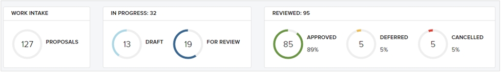
What questions are we trying to answer? Aside from the obvious information of how many proposals are in work, the more useful question is “how effective is our governance?”
Why is it useful? Most governance teams do not track the effectiveness of their decision making. The Intake dashboard highlights governance decisions.
How do we use it? What action to take? If governance teams approve 100% of requests, this could imply a broken governance process that does not adequately screen out projects. If it is determined that too many projects are approved, the governance team should discuss how to strengthen their actual decision-making process to facilitate higher quality strategic decisions.
What data do we need? A count of the number of projects drafted, ready for review, approved, deferred, or cancelled.
When should it be used? A Project Management Office should monitor this information and periodically review it with the portfolio governance team (annually at a minimum).
Risk-Value Bubble Chart for Work Intake
What is it? The Risk-Value bubble chart is a visualization of the project portfolio that captures relative value and relative risk of each project based on the prioritization scores of each project. We will cover the application of this chart for work intake here and cover other details in relationship to prioritization down below.
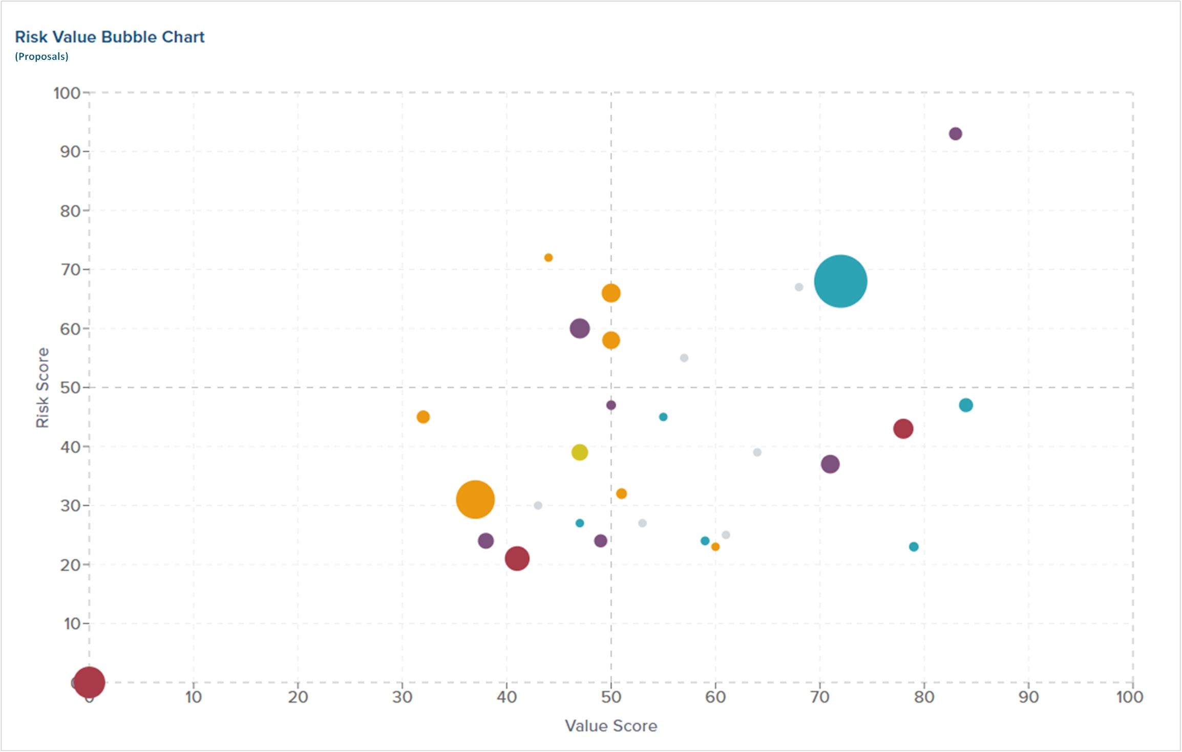
Why is it useful? For Work Intake, the Risk-Value bubble chart provides a comprehensive visualization of the entire portfolio in support of making better strategic investments.
What questions are we trying to answer? A fundamental investment question during Work Intake is to ask “are we selecting the right projects?” In order to be successful with portfolio management, the portfolio governance team needs to select winning projects.
How do we use it? What action to take? Leadership can see where proposals are plotted on the bubble chart to further understand the relative value and risk of proposed projects.
What data do we need? In order to plot each project on the bubble chart, a value score and risk score are needed. The bubble size can be based on either financial cost or financial benefit (or other measures). Additional color coding can be added to differentiate projects based on strategic goals, departmental alignment, or other categorical information.
When should it be used? When leadership teams are having governance meetings to select new projects.
Box and Whisker Plot
What is it? A box and whisker plot or diagram (otherwise known as a boxplot), is a graph summarizing a set of data. The shape of the boxplot shows how the data is distributed and it also shows any outliers. This plot is useful when applying project and portfolio data. This is by far an uncommon portfolio management chart, but useful in its application.

What questions are we trying to answer? The box plot can help answer several questions such as “what is the average project spend by department?” Or, “how long (duration) are projects by department?”
Why is it useful? It takes historical data to validate claims of future projects.
How do we use it? What action to take? Let’s focus on the question related to project duration. If a new proposed project claims that a new Technology project can be completed in less than 150 days, our historical data would indicate that this has not happened before and that most Technology projects take at least 300 days on average (according to the image above).
What data do we need? The Project Management Office (PMO) should collect metadata such as sponsoring department, strategic goal, category, etc. and combine it with quantitative data such as financial cost, project duration, etc.
When should it be used? This type of chart should be used by the PMO to validate claims prior to bringing a proposed project to the portfolio governance team. A Portfolio Manager can further use this chart for analysis of the portfolio.
Project Prioritization Charts
Project prioritization is about delivering the maximum value possible through programs and projects. In order to maximize value delivery, governance teams that approve work need to share a common view of “value” in order to select the most valuable work and assign the right resources to that work. Two useful portfolio management charts include the Risk-Value Bubble Chart and a Priority Heatmap.
Risk-Value Bubble Chart for Prioritization
What is it? The Risk-Value bubble chart is a visualization of the project portfolio that captures relative value and relative risk of each project based on the prioritization scores of each project.
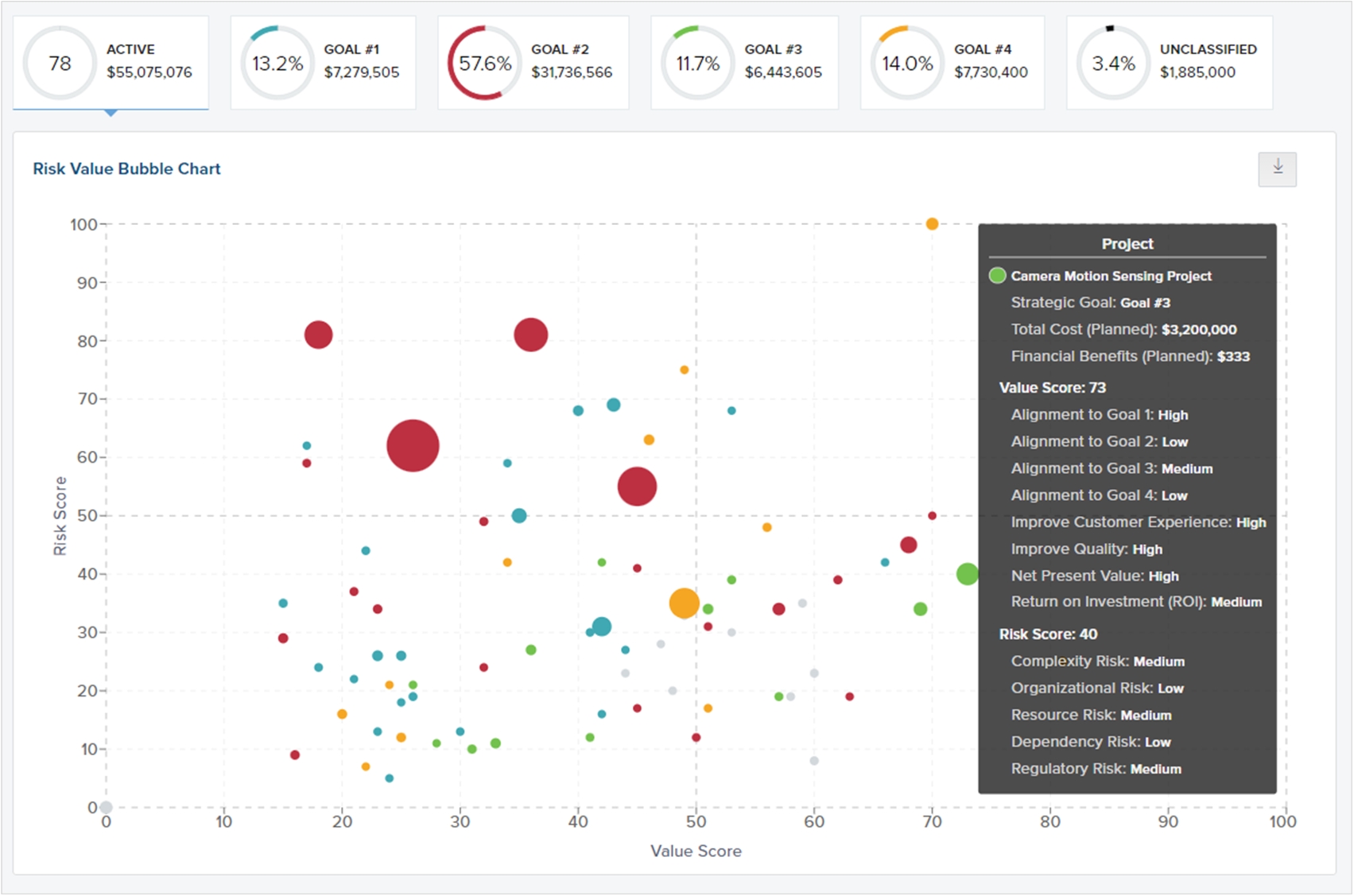
Why is it useful? The Risk-Value bubble chart is one of the most useful portfolio charts because it provides a comprehensive visualization of the entire portfolio in support of strategic investments. The Risk-value bubble chart is based on the value and riskiness of each project and can be conveyed across multiple dimensions.
What questions are we trying to answer? Fundamentally, the portfolio governance team needs to understand how they are investing in projects across various dimensions (e.g. by department, by category, by strategic pillar, etc.) in order to answer the question “how are we investing in different areas? Are we over-investing or under-investing in certain key areas.”
How do we use it? What action to take? Users can see the financial investment levels across key measures, which quickly communicates the level of spending across key areas. If spending levels are not in line with expectations, the first action the portfolio governance team should take is to re-assess spending levels and initiate new work and/or defer or cancel existing work in order to get the portfolio back in alignment with spending expectations. Furthermore, if there are too many low-value but risky projects in the portfolio, the portfolio governance team must assess how to reduce risk and increase value across the portfolio.
What data do we need? In order to plot each project on the bubble chart, a value score and risk score are needed. The bubble size can be based on either financial cost or financial benefit (or other measures). Additional color coding can be added to differentiate projects based on strategic goals, departmental alignment, or other categorical information.
When should it be used? In this context, many governance teams find it useful to review the Risk-Value Bubble Chart during quarterly portfolio review sessions or other strategy sessions.
Priority Heatmap
What is it? The Priority Heatmap provides a visualization of how projects are scored and ranked across scoring criteria.

What questions are we trying to answer? When leadership teams are doing prioritization exercises, it is important to understand why certain projects rank higher compared to other projects. The Priority Heatmap provides clarity as to why certain projects are ranked higher than others.
Why is it useful? The Priority Heatmap provides another holistic visualization of the projects in the portfolio across scoring criteria and highlights why some projects are more valuable (or risky) compared to other projects.
How do we use it? What action to take? Leadership teams can use the Priority Heatmap when conducting prioritization exercises in order to quickly re-evaluate project importance and make adjustments as needed.
What data do we need? The same scoring data that feeds the Value score and Risk score will be displayed in the Priority Heatmap.
When should it be used? During prioritization exercises, quarterly portfolio reviews, or other strategy sessions.
PPM Dashboards: Resource Management Charts
Resource capacity planning is about comparing forecasted resource utilization (future-looking view) of project resources against available capacity to get project work done. The portfolio management charts below will help improve resource management.
Resource Heatmap
What is it? The resource heatmap is a visualization of teams and individuals to highlight over-utilization, risk of over-utilization, and available resources. This is an extremely useful portfolio management chart that can help PMO’s support better resource management.
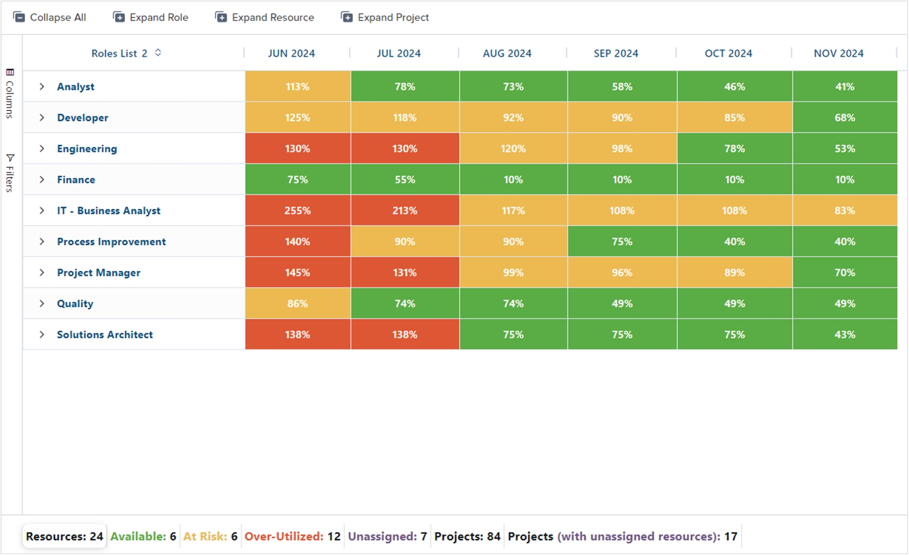
What questions are we trying to answer? Fundamentally, the portfolio governance team wants to answer the question “when can we take on new project work?” The resource heatmap answers the questions “which resources are available?”
Why is it useful? Resource capacity is hard to manage, but the resource heatmap makes it easier to quickly identify teams that are over-utilized and make a determination
How do we use it? What action to take? The visualization alone highlights which teams are over-utilized, but we can expand the resource heatmap even further to see the utilization of individual resources. Based on resource availability, a Portfolio Manager can recommend whether there are available resources to take on additional work.
What data do we need? An aggregation of resource forecasts for each individual on a team over a period of time (such as month over month), the resource hierarchy, and thresholds for determining over and under-utilization.
When should it be used? PMO’s and Portfolio Managers should be evaluating resource utilization on an ongoing basis but especially as new project proposals are being reviewed. Organizations need to take great care not to approve too many projects but only initiate new work as resources are available to do the work.
Resource Chart
What is it? The resource chart is a bar-chart that compares utilization on a timescale (such as weekly, monthly) and compares it against total capacity (total FTE’s).
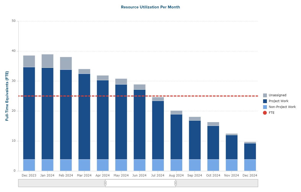
We could make several variations of this chart. In the example below, we have stacked resource utilization based on the priority of the project. What this chart is telling us is that in the early part of the year there are generally enough resources to get high priority and medium priority work done, but no available resources to work on lower priority projects.
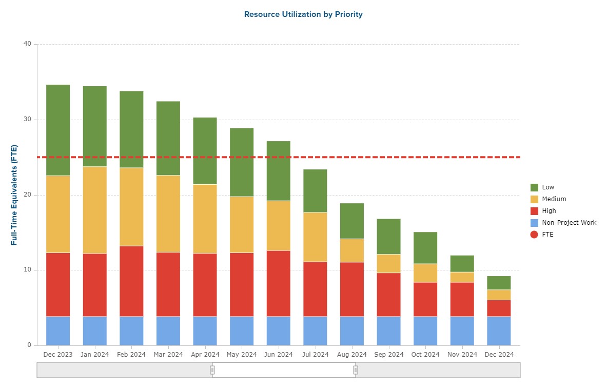
What questions are we trying to answer? For longer-term planning, we want to understand when there will be general availability to take on new project work as well as understand the level of unassigned work.
Why is it useful? This chart provides a macro-view of resource utilization
How do we use it? What action to take? Unlike the resource heatmap which provides a more granular view of team utilization, the resource chart provides a quick look across the whole organization to understand total project demand, unfulfilled resource demand, and future availability.
What data do we need? An aggregation of resource data broken out by category (e.g. project, non-project, unassigned) over a period of time (such as month over month), and the number of total resources.
When should it be used? The chart can be reviewed in conjunction with
PPM Dashboards for Project Performance
Performance management is about tracking projects in the portfolio to measure current performance in order to safely deliver project value to stakeholders. The most common dashboard is a project status report that communicates various aspects of project performance, but we have other portfolio level charts that communicate portfolio health as well.
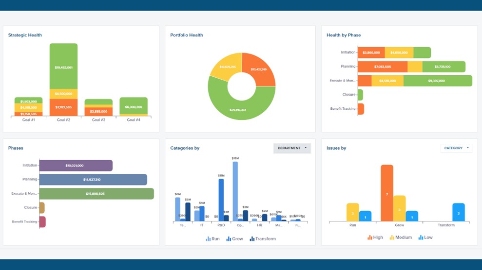
Portfolio Health Dashboard
What is it? A portfolio health dashboard helps communicate the overall health of the portfolio across various dimensions.
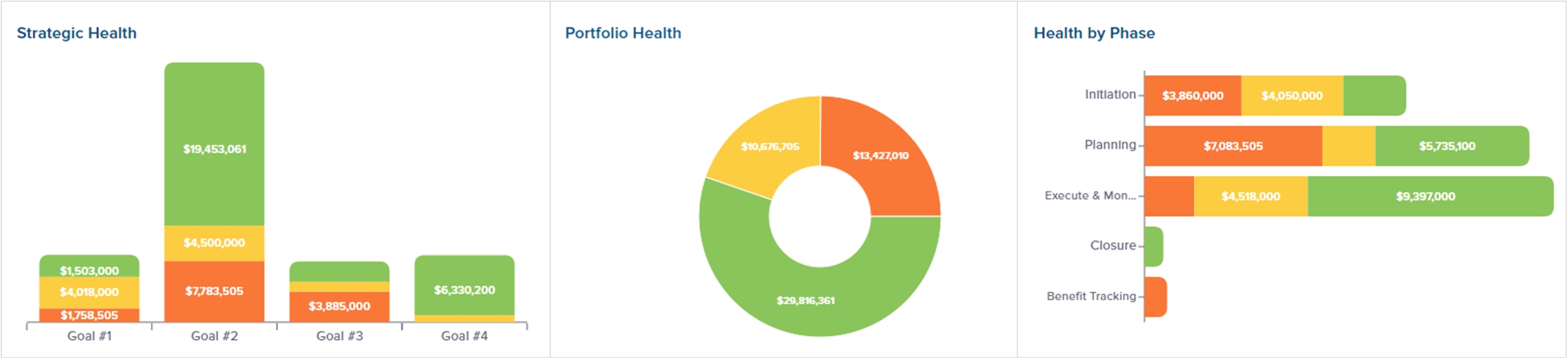
What questions are we trying to answer? The fundamental question is “how are we performing?” The portfolio governance team has a responsibility to help keep project investments on track, but without understanding the health of the portfolio, it is difficult to take action.
Why is it useful? Looking at portfolio health from different angles helps the leadership team understand how the business is performing and take appropriate action at the right time.
How do we use it? What action to take? The portfolio health dashboard is intended to help leadership understand the overall health of the portfolio and take action when appropriate. By firstly viewing the overall percentage of the portfolio that is in a red or yellow status could trigger additional action by the PMO and governance team. Such dashboards make it easier to pinpoint performance issues, drill down into specific projects, and investigate issues that need resolution.
What data do we need? At a minimum, the count of projects in a red, yellow, and green status. Adding financial data significantly improves the analysis and adding other metadata such as strategic alignment, current phase, sponsoring department provides additional views into portfolio health.
When should it be used? The PMO should be monitoring this type of dashboard on a weekly basis, especially as status reports get updated. The portfolio governance team should monitor this information at least monthly, but the PMO should escalate issues that needs governance attention sooner.
Project Performance by Completion Month
What is it? Project performance by completion month communicates how many projects are expected to complete in a given month and provides the current status of that project.
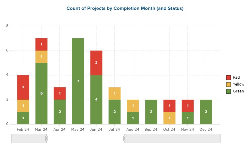
What questions are we trying to answer? This chart helps answer the question “are we on-track with upcoming releases?”
Why is it useful? This chart provides another visualization to hone in on projects that expected to complete in the near-term and understand if there are any projects in trouble that close to launch.
How do we use it? What action to take? This is another great tool that the PMO can use to monitor current project performance sequenced by launch date. Having too many projects complete at the same time can be a portfolio risk, and if there are multiple projects in a red or yellow status, this also needs to be addressed to help ensure successful delivery.
What data do we need? The planned finish date (to calculate completion month) and current status of each project in the portfolio.
When should it be used? The PMO should monitor this weekly as it can act as an early warning indicator for projects that are set to complete in the near future and further prioritize actions to ensure that projects that are nearly complete can successfully finish. We would recommend incorporating such a chart into monthly status review meetings.
Project Status Over Time
What is it? Project status over time is a trend chart to see how project performance has changed over time. If there was an increase in the number of yellow and red projects over a period of time, that could be a sign that portfolio health is “out of tolerance”. Typically, organizations take a single snapshot in time of the portfolio health; but this chart will highlight trends as well.
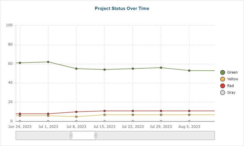
What questions are we trying to answer? We want to understand if our current portfolio health is normal.
Why is it useful? Snapshot data is limited, but trend data can spot other activities and help the portfolio governance team take appropriate action.
How do we use it? What action to take? The PMO should firstly review the chart to monitor if the number of red and yellow projects has exceeded an unwanted threshold. If a threshold has been exceeded, the portfolio governance team may need to evaluate priorities, resourcing, and the amount of work in order to stabilize the portfolio.
What data do we need? The count of each red, yellow, and green stoplight for all active projects over a period of time (such as week over week)
When should it be used? This should also be a standard tool for the PMO to monitor portfolio health. This chart only needs to be shared with the portfolio governance team if the portfolio goes off track.
Project Status Reports
What is it? A project status report is a mechanism to communicate performance details to stakeholders and ask for help from senior leadership.

What questions are we trying to answer? A quality status report should answer more than just “how are we performing?” An experienced Project Manager should tell the story of how the project is progressing and whether the project will still deliver the intended value. Good Project Managers also know how to ask for help, and a good status report will answer the question “is leadership help needed?”.
Why is it useful? Status reports can be useful if the Project Manager can tell the story of whether the project will deliver value as expected. When the Project Manager can tell this story and avoid simply stating all the things that the team did in the last reporting period, a status report can be quite useful. Sadly, most organizations focus on how busy the team was and share all the completed tasks. Most leaders don’t care about this level of detail. In fact, most senior leaders only want to get involved when their help is needed. In other words, if the project is legitimately green, no need to bother key stakeholders.
How do we use it? What action to take? Good PMO’s will conduct a regular status review meeting with the portfolio governance team to review projects in a red or yellow status. This maintains stronger communication between project teams and leadership. Part of the purpose of the status review meeting is to determine what actions are needed in order to recover the project.
What data do we need? Good status reports will include more than just metrics and stoplights. A narrative of the project performance should include the overall status of the project, key accomplishments, upcoming activities, and help needed. Additional information such as milestones, risks, and issues can also be included to inform stakeholders about project performance.
When should it be used? Project teams should provide status reports on a regular interval, at a minimum of once a month. Other PMO reports can be incorporated into these meetings as well.
Portfolio Management Matrix for Portfolio Planning
Portfolio planning is a senior leadership activity within project portfolio management to reconcile the strategic plan with the right projects and to sequence those projects according to priorities, resources, dependencies, and current environmental conditions. In this last section, we will share one very effective portfolio management chart that highlights project interdependencies.
Project Portfolio Dependency Matrix
What is it? The portfolio-level dependency matrix captures the key relationships between all projects in the portfolio. Project Leaders need to assess the level of impact in order to help the PMO, Portfolio Manager, and Program Manager (if applicable) to sequence projects appropriately. Projects that have numerous upstream dependencies have a much higher risk, whereas projects that affect multiple downstream projects will probably have a higher priority (thus receiving more resources and more attention) so as not to disrupt the downstream projects.

What questions are we trying to answer? The dependency matrix helps answer a key question “what the impacts between projects?” Answering this question helps to identify potential solutions or arrangements between project teams to help optimize project delivery.
Why is it useful? Without such a matrix, it can be painstaking to collect this information. Without this information, unknown dependencies represent risks to the portfolio.
How do we use it? What action to take? A PMO can map upstream and downstream relationships between projects, the types of relationships, and the level of severity. Having this information equips the PMO to set up mitigation approaches to minimize negative impacts as a result of these dependencies. Project and portfolio communication is further strengthened when dependency information is broadly shared. The key actions are related to portfolio planning itself; optimizing the timing and sequencing of projects in the portfolio is an output of using the dependency matrix.
What data do we need? A PMO should collect dependency information across all projects (although many projects will not have a dependency to other projects) including dependency type and dependency severity. This information can be stored and visualized in PPM tool such as Acuity PPM.
When should it be used? A PMO can use the portfolio level dependency matrix in support of strategic and portfolio planning as well as ongoing tactical project execution.
Tim is a project and portfolio management consultant with over 15 years of experience working with the Fortune 500. He is an expert in maturity-based PPM and helps PMO Leaders build and improve their PMO to unlock more value for their company. He is one of the original PfMP’s (Portfolio Management Professionals) and a public speaker at business conferences and PMI events.
[activecampaign form=3]
What is a risk-value bubble chart?
The Risk-Value bubble chart is a visualization of the project portfolio that captures relative value and relative risk of each project based on the prioritization scores of each project. The Risk-Value bubble chart is one of the most useful portfolio charts because it provides a comprehensive visualization of the entire portfolio in support of strategic investments. The Risk-value bubble chart is based on the value and riskiness of each project and can be conveyed across multiple dimensions.
What is a portfolio health dashboard?
A portfolio health dashboard helps communicate the overall health of the portfolio across various dimensions. Looking at portfolio health from different angles helps the leadership team understand how the business is performing and take appropriate action at the right time.
What is a resource heatmap?
The resource heatmap is a visualization of teams and individuals to highlight over-utilization, risk of over-utilization, and available resources. Resource capacity is hard to manage, but the resource heatmap makes it easier to quickly identify teams that are over-utilized and make a determination.
What are the elements of a good status report?
A project status report is a mechanism to communicate performance details to stakeholders and ask for help from senior leadership. Status reports can be useful if the Project Manager can tell the story of whether the project will deliver value as expected. A quality status report should answer more than just “how are we performing?” An experienced Project Manager should tell the story of how the project is progressing and whether the project will still deliver the intended value. Good Project Managers also know how to ask for help, and a good status report will answer the question “is leadership help needed?”.
Never miss an Acuity PPM article
Don't take our word, listen to what others are saying:
"I find value in all of your articles."
"Your articles are interesting and I am sharing them with my team who have limited project knowledge. They are very useful."